20+ Best React Component Libraries of 2025
Building and developing an impressive and accessible website is now like clockwork with React. This framework makes the development process easier and faster. Along with that, it optimizes your website or application to become more engaging.
React is the most famous Javascript framework today. And to smoothen the development process it has many UI component libraries. These React component libraries offer ready-made components and customizable components.
In this blog, we will share 15+ Best React Component Library, their benefits drawbacks, and a short overview. It will help you to choose the best UI library for your React projects.
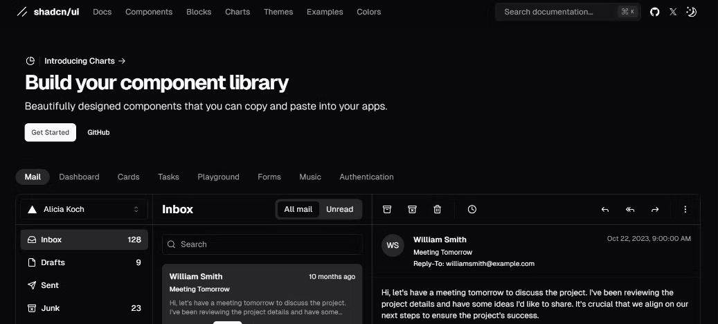
Shadcn UI
Shadcn UI is a rapidly growing component library that leverages Tailwind CSS and Radix UI for styling. It offers a fresh approach to building user interfaces with a focus on simplicity, speed, and accessibility.
Instead of bundling all the components into a package for you to download into your project, Shadcn UI takes a copy-and-paste approach and allows you to copy the code for any document directly into your project.
Shadcn UI has over 66k GitHub stars.
KEY FEATURES
- Themes and Theme Editor: It provides a robust theme editor that allows you to easily customize colors, border radius, and other visual elements to match your brand identity or project requirements.
- Light and Dark Mode: Shadcn UI supports light and dark mode out of the box. You can use this feature to integrate theme toggling functionality into your application.
- Supports Tailwind CSS: It is built on top of Tailwind CSS and benefits from Tailwind’s utility-first approach. This means you can quickly create custom styles without writing extensive CSS code.
- Edit in v0: This feature allows you to open a Shadcn UI component in the v0 app — Vercel’s AI tool that generates React components — and adjust the component via prompts.
BENEFITS
- Tailored Designs: The theme editor and its integration with Tailwind CSS provide greater freedom for customizations. It allows you to create unique and branded user interfaces that match your project’s and brand’s requirements.
- Component Ownership: Shadcn UI gives you more control and ownership over its components by giving you direct access to the components’ code. With this approach, every component you use will live directly in your codebase.
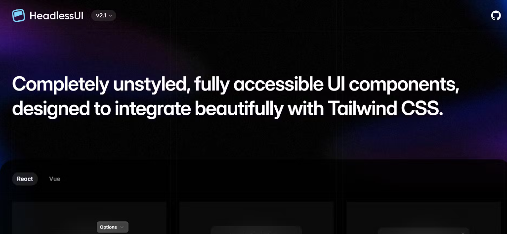
Headless UI
Similar to Radix UI, Headless UI is a collection of unstyled, accessible UI components. It is built on top of Tailwind CSS and gives developers the freedom to control the look and feel of their user interfaces.
Headless UI has over 25k GitHub stars and over 1.8 million weekly downloads.
KEY FEATURES
- Unstyled Components: Headless UI provides the essential building blocks for UI elements without any predefined styles. This gives you complete freedom to customize the appearance using your preferred styling solution.
- Accessibility Focus: The library prioritizes accessibility, ensuring components are keyboard navigable, screen reader compatible, and adhere to WCAG guidelines.
- Tailwind CSS Integration: Headless UI seamlessly integrates with Tailwind CSS for rapid styling and customization.
BENEFITS
- Complete Customization: Headless UI gives you full control over the visual design of its components and allows you to create unique and branded user interfaces.
- Improved Accessibility: By focusing on accessibility from the ground up, Headless UI helps with building inclusive applications.
- Enhanced Performance: The lightweight nature of Headless UI’s components ensures that the applications you build with it are fast and performant.
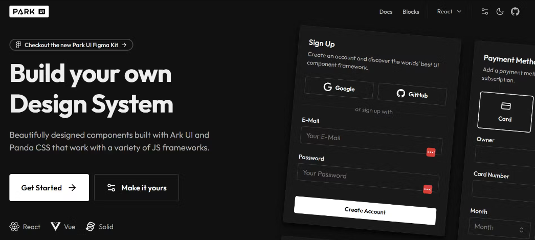
Park UI
Park UI is a React component library built on Ark UI and Panda CSS. It is a very new library; it was released in 2024. As of this article’s 2025 update, Park UI has 1.8k+ GitHub stars.
Besides supporting React — and Vue — Park UI also supports Solid.js and metaframeworks like Next.js and Nuxt.
KEY FEATURES
- Theme Editor: Park UI’s theme editor allows you to define custom styles for fonts, colors, and radius via its editor panel. Once you’ve created your desired theme, you can copy its config code into your project. This reduces the trouble of having to manually create a custom theme.
- Supports Panda CSS: It is built on Panda CSS, a CSS-in-JS library built by the creator of Chakra UI.
- Blocks: Park UI provides Blocks, a pre-built collection of common UI elements like banners, footers, and cards. You can copy the code for different blocks and paste into your project.
BENEFITS
- Accessible: Park UI follows accessibility standards and guidelines, ensuring that the components are accessible to all users.
- Supports several frameworks: Imagine you’ve mastered a Vue component library but can’t use it anymore because it’s not supported by other frameworks. Thankfully, you don’t have to worry about that with Park UI, as it supports various frameworks, including Vue, Solid.js, Nuxt, and Next.js.
Flowbite React
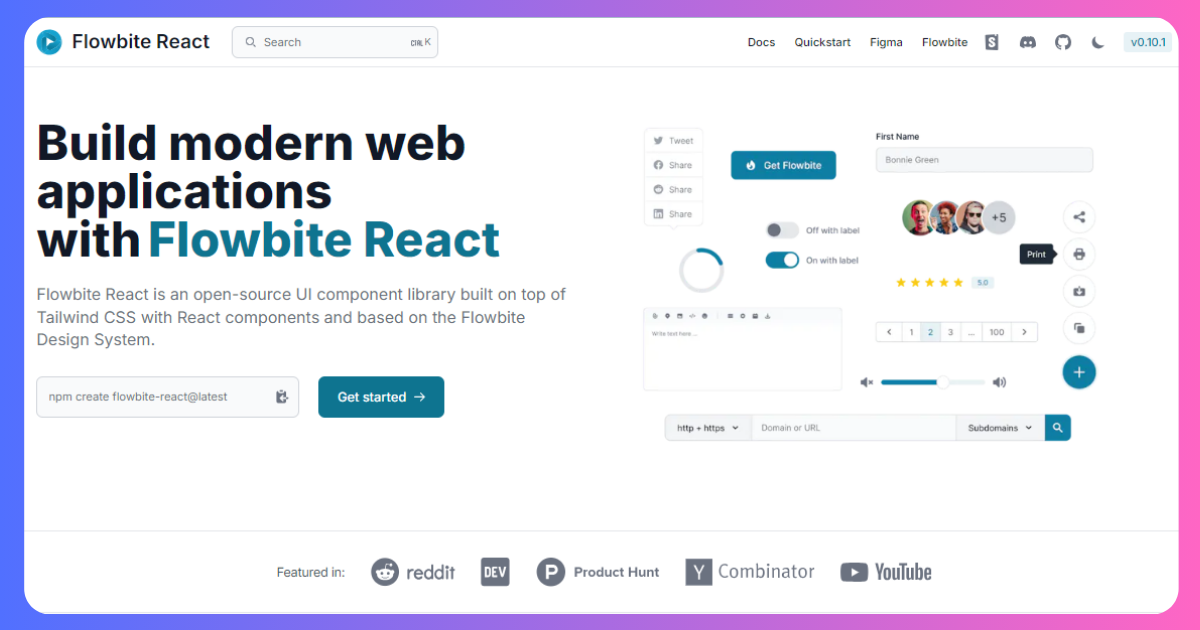
Flowbite is an open-source, free React UI library with 100+ Tailwind CSS interactive UI elements. With ready-to-use React UI kits, Flowbite makes Tailwind CSS more accessible for developers. Flowbite React UI elements are appealing, customizable, and highly scalable.
Together with Flowbite React, you can quickly implement and enable rapid development. The React components effortlessly fit into complex projects. Moreover, with this open-source React component library, you can simply make responsive and high-performance web projects.
Key Features
- Flowbite React has 100+ pre-built and user-friendly Tailwind CSS UI elements.
- The UI components are scalable, customizable, and optimized for performance.
- The components are fully responsive and have cross-browser compatibility.
- This React component library ensures fast loading speed and has a light impact on your web application.
Benefits
- Flowbite React is a free React component library.
- All the components are responsive and customizable.
- It offers fast loading speed to your web projects.
Drawbacks
- Advanced customization needs a solid knowledge of Tailwind CSS.
Material UI
Material UI is an open-source developed by MUI, it’s a react component library that implements Google’s Material Design. It includes a pre-built collection of out-of-the-box components that are ready to use in production.
It has over 92.9k GitHub stars and over 3.8 million weekly downloads on NPM.
KEY FEATURES
- Typography: Material UI follows its typography guidelines to ensure all text elements have consistent text styling.
- Icons: Material UI provides a collection of icons that can be used in your application. The icons can be imported from the
@mui/icons-materialpackage. - Form controls: Material UI provides a range of form components like text fields, checkboxes, radio buttons, and select menus, to make creating a user-friendly form easy and accessible.
- Themes: Material UI offers theme toggling customization with support for dark and light modes. You can customize the theme to your preferred choice using the
ThemeProvidercomponent.
BENEFITS
- Aesthetics: Material UI has modern, beautiful designs to select from. They follow their very intuitive design guidelines to make sure the design aesthetics are top-notch.
- Customization: Material UI offers customization options that allow developers to easily tailor components and themes to their preferred designs.
- Accessibility: Material UI prioritizes accessibility. The library is designed to be accessible by default, making it easier to create usable applications for everyone.
- Responsive Design: Material UI components are responsive to ensure your application works well on different screen sizes and devices.
- Developer-Friendly: The documentation is well-written, so developers can easily understand and use the library. The components are also easy to import and implement.
Chakra UI
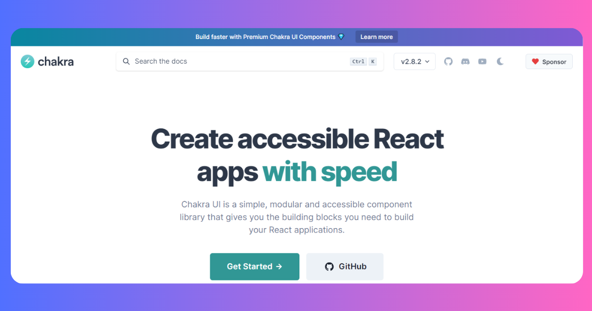
Chakra UI is another React component library. It has 180+ React UI components. It is mostly popular to small and medium-sized businesses for simplicity and flexibility. Chakra UI has a modular architecture so you can easily pick a component that you need. It provides better accessibility as well and meets the standards of WCAG (Web Content Accessibility Guidelines).
Moreover, all the components of this React library are customizable, flexible, and easily accessible. It also has built-in theme support to make the customization easy. The library smoothly integrates with React Hook Form, Final Form, and Formik.
Key Features
- Chakra UI has 180+ React UI components and is mostly popular to small and medium-sized businesses.
- It has a modular and reusable architecture so you can make your projects smoothly accessible.
- This library allows you to create custom themes for your application.
- It has built-in performance measures such as reducing bundle size and automated code splitting.
Benefits
- Chakra UI is simple to understand and implement.
- You can easily scale and customize the components.
- The documentation is well-written with proper guidelines.
Drawbacks
- It has limited color variants.
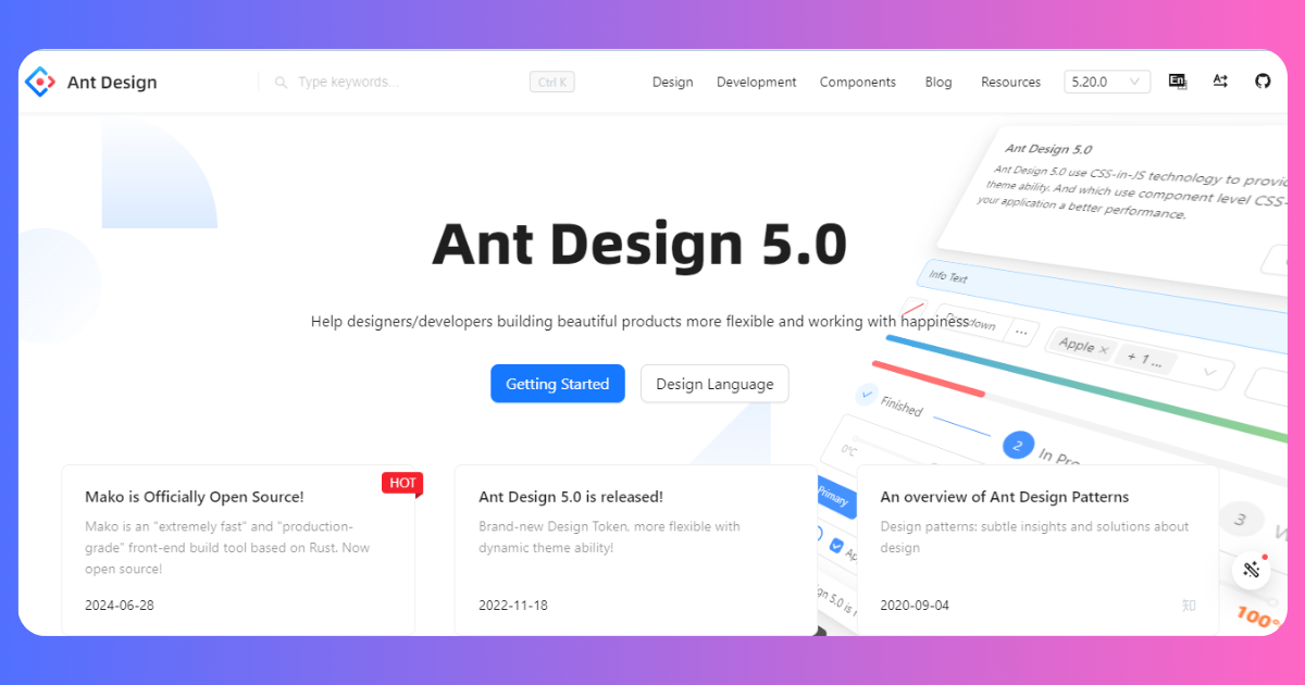
Ant Design
Ant Design is a well-documented React UI library with high-quality React components. It is a popular React library and one of the most used libraries, with over 91.5k stars on GitHub and over 1.3 million weekly downloads on NPM. Ant Design is an excellent choice if you want to build enterprise-grade products.
KEY FEATURES
- Internationalization Support: Ant Design supports dozens of languages and has built-in internationalization support for global users.
- Theme: Ant Design allows theme customization, so you can integrate your light and dark theme and customize your preferred theme mode.
- Icons: Ant Design offers a variety of icons from the
@ant-design/iconspackage. - Navigation Menus: The library includes React components for navigation, like the
MenusandSidebars. - Data Visualization: Ant Design provides data visualization components like Charts and
Graphs. This can be accessed from the@ant-design/chartspackage. - Date Pickers and Calendar: It also provides date pickers, time pickers, and calendars that can be customized to your choice.
- Popovers and Tooltips: It offers popups and tooltips that show context-sensitive information.
BENEFITS
- Customization: It allows theming and customization and gives you customization control over typography, style, and colors to fit your preferred design.
- Accessibility: It follows accessibility best practices, allowing you to build for all types of users.
- Form Controls: It has a robust form validation that helps to simplify your form validation logic.
- Community Support: The library has a large and active community of developers who are maintaining, contributing, and improving the library. There are also articles to help you as you build.
- Enterprise-Grade: It is designed and built with enterprise applications in mind and provides a well-designed and professional look for your enterprise or business applications.
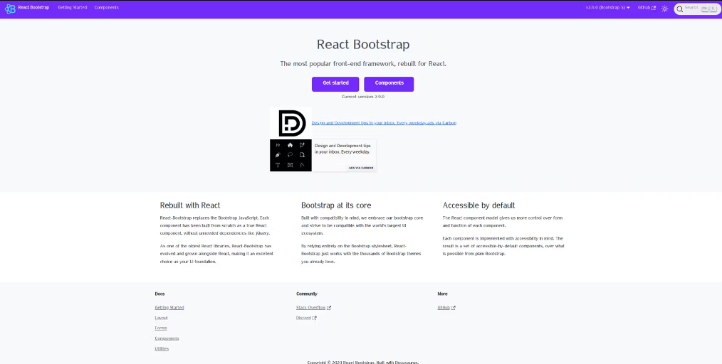
React-Bootstrap
React-Bootstrap is also one of the most popular React UI libraries. Built on top of the popular Bootstrap CSS framework, this library brings Bootstrap’s components to React as it aims to replace Bootstrap JavaScript.
React Bootstrap has over 22.3k stars on GitHub and over 1.1 million weekly downloads on NPM.
KEY FEATURES
- Bootstrap Components: React BootsStrap offers a wide range of Bootstrap components that include buttons, forms, navigation, modals, and so on.
- Theme: React BootStrap provides theme support through Bootstrap SASS variables.
- Accessibility: Each component is built with accessibility in mind and follows the accessibility standards.
- Forms: React BootStrap provides form components that support form validations.
- React Hooks Support: React BootStrap components are compatible with React hooks. This means the state can be passed within the React BootStrap component as props, making managing your states and effects easier.
BENEFITS
- Responsive Design: React BootStrap grid system ensures your web apps look and work well on various screen sizes and devices. It is built with Flexbox and is fully responsive.
- Customization: React BootStrap allows developers to customize and extend components to match their applications’ designs.
- Community Support: React BootStrap has elaborate documentation that explains how to use the library. Due to the large active community, there are tutorials and resources online that will also guide you on how to work with the library.
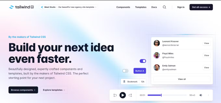
Tailwind UI
Tailwind UI is an official UI library by the creators of Tailwind CSS. It provides pre-built, customizable, and production-ready UI components for Tailwind CSS. It is a paid library with monthly and yearly pricing options.
KEY FEATURES
- Pre-built components: Tailwind UI offers dozens of pre-designed, pre-built UI components like navigation bars, hero sections, cards, forms, and more.
- Designs for popular frameworks: Components come with React, Vue, and AlpineJS code examples, so you can easily integrate them.
- Customizable: All components are customizable with Tailwind CSS utility classes. Modify colors, spacing, fonts, etc.
- Growing library: New components are continuously added based on user feedback and requests.
- Premium support: Paid plans include one-on-one email support from the Tailwind UI team.
BENEFITS
- Saves development time: The ready-made components help you build UIs faster vs. coding from scratch.
- Beautiful designs: Components follow best practices for aesthetics, usability, and accessibility.
- Easy to customize: Tailwind CSS classes allow extensive customization with minimal effort.
- Supports popular frameworks: Integrate components easily into React, Vue, and AlpineJS apps.
- Active development: The team regularly adds new components and improvements.
- Documentation: Clear instructions and examples for using and configuring components.
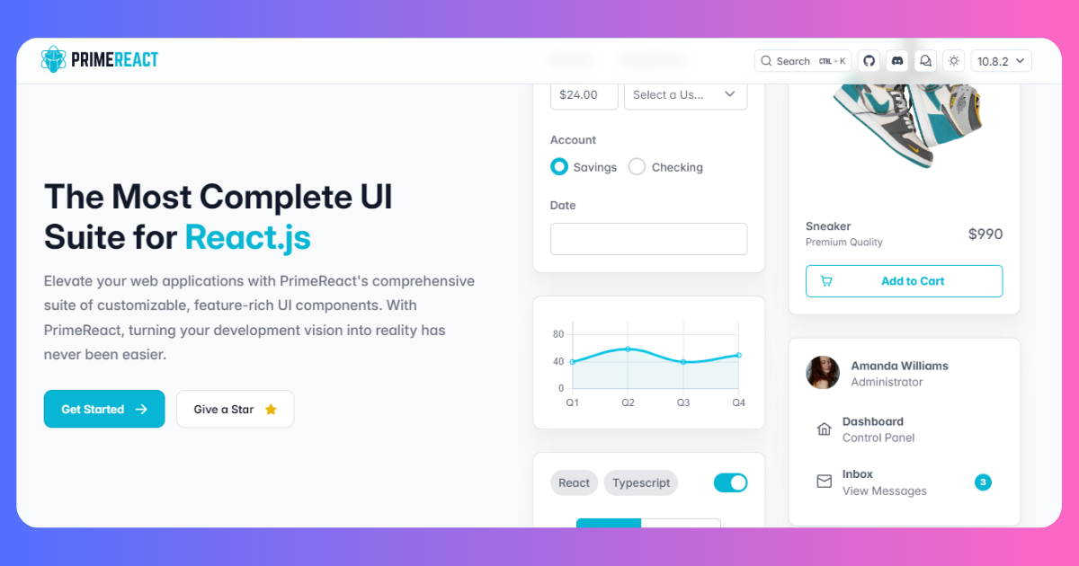
PrimeReact
PrimeReact is a rich set of open-source UI components for React designed for the PrimeNG ecosystem. It is a design-agnostic React component library with over 156k weekly NPM downloads and 6.4k GitHub stars.
This is one of my favorites because of the list of features that it possesses and offers out-of-the-box. You can do a lot with the PrimeReact library without installing extra packages.

KEY FEATURES
- Data Tables: PrimeReact offers data table components with features like sorting, filtering, and pagination.
- Form Inputs: Forms in PrimeReact include checkboxes, radio buttons, and date pickers, all with pre-built validation support.
- Charts: PrimeReact includes chart components like bar charts, line, and pie charts, which are easily customizable.
- Navigation Menus: Menus like breadcrumbs and tab menus are the different types of navigation menus that PrimeReact supports.
- Rich Text Editor: PrimeReact provides a rich text editor to integrate into your content and text formatting application.
- Lazy loading: Components in PrimeReact can be lazy-loaded to improve or optimize your application’s performance.
- Widgets: Sliders, progress bars, and badges are available in the PrimeReact library.
- Icons: PrimeReact has a package called
PrimeIconscontaining its icons. - Hooks: PrimeReact supports hooks that can be imported and used from the
primereact/hookspackage. - Overlay: PrimeReact provides overlay tooltips and popup components that allow you to show context-sensitive information and modal messages.
BENEFITS
- Components: PrimeReact provides a comprehensive collection of UI components, from basic components like input fields and buttons to complex components like charts and media carousels.
- Templates: PrimeReact offers customizable templates to use and build your projects. In addition, they also offer dozens of intuitive icons that you can integrate into your application.
- Theme: PrimeReact allows developers to customize the appearance and behavior of components. It also ships various themes that you can choose from.
- Responsive: PrimeReact is designed to be responsive out-of-the-box, making your application look good on various screen sizes.
- Accessibility: PrimeReact prioritizes accessibility and follows the accessibility standards to give you components you can use to build apps for every user.
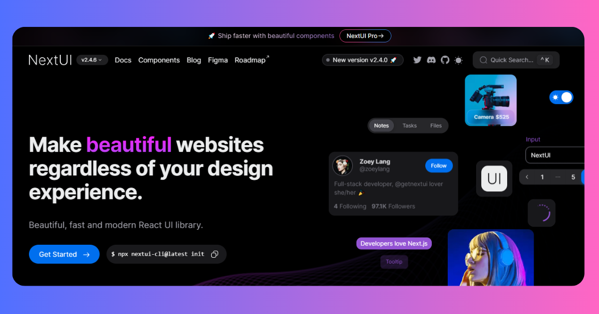
Next UI
Next UI is a fully-featured React UI library with excellent performance, perfect for your web applications. Whether you are a beginner or an experienced developer, you can easily build your application with the library.
Next UI is also based on Tailwind Variants and is written in TypeScript. It has over 21k stars on GitHub and over 120k weekly downloads on NPM.
KEY FEATURES
- Theme: Next UI has a well-scaled default dark theme to apply to your application. You can define themes, color schemes, and styles according to your preferred project.
- Lazy Loading: Many Next UI components support lazy loading, which can help improve your app’s performance by loading components and assets only when needed.
- Internationalization Support: Next UI includes internationalization support, making creating multilingual applications for a global user base easier.
- Form Validation: Form components in Next UI come with built-in form validations, helping to simplify the process of handling form validation logic.
- Animations and Transition: Next UI components often include animations and transition support for smooth and clean UI interactions. It uses Framer Motion to animate some components due to the complexity of the animations.
BENEFITS
- Accessibility: This is a top priority with Next UI. Next UI components are built on top of React Aria and follow WAI-ARIA guidelines to ensure exceptional accessibility support.
- Customization: Next UI allows easy customization for themes, typography, and styles. The flexibility allows for unique and beautiful UI designs.
- Developer Experience: Next UI is built with developers in mind, offering a very user-friendly and intuitive API. It is easy for beginner and advanced developers to grasp and use. The documentation also provides a thorough explanation with examples of using and configuring the library.
- Reusable Components: Next UI provides a comprehensive set of reusable UI components. These components can be easily integrated into your React application, reducing development time.
- Community: The community is active and growing. The library is actively maintained, bugs are fixed, and new features are regularly introduced and added.
Fluent UI Taiwind React Library
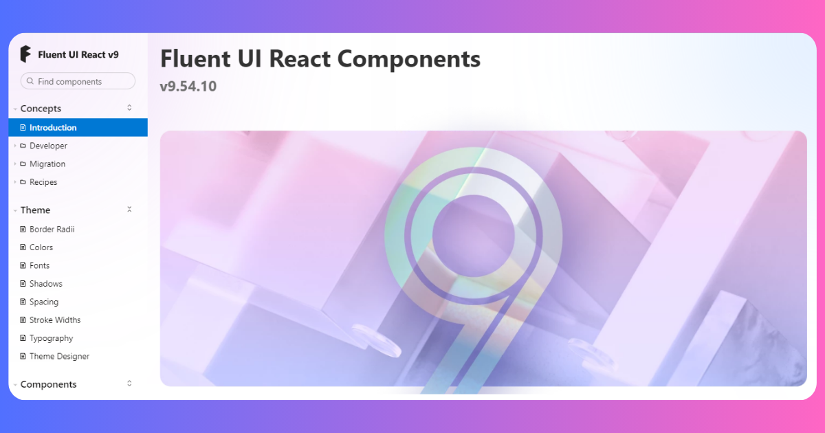
Fluent UI or UI Fabric is developed by Microsoft. It is a feature-rich and open-source React component library. Fluent UI provides 950+ components to build your projects. All the components have cross-platform consistency and are optimized for performance and efficiency.
You can smoothly customize the components and themes. Additionally, it provides developer and designer-friendly tools to create engaging applications. As they are pre-built, you don’t have to create the design from scratch.
Key Features
- Fluent UI is a feature-rich open-source React UI kit, developed by Microsoft.
- The components are cross-platform and consistent. So, you just need to design it once and deploy it on any platform.
- It allows developers to create appealing, engaging, and easily accessible web applications.
Benefits
- This library gives a professional and user-friendly look into your design.
- It gives built-in accessibility and custom theme options.
- All the components are fully responsive allowing you to create designs for different screen sizes.
Drawbacks
- The documentation is not well-defined.
Grommet
Grommet is a responsive library focused on scalability and accessible design. It is an all-around React UI library to build web-accessible and responsive applications.
Grommet is known for its focus on usability, theming, and extensive intuitive components. It is a part design system and part framework. It has over 8k GitHub stars and over 26k weekly downloads on NPM.
KEY FEATURES
- Theming: Grommet’s theming is one of its best features. It has built-in themes that you can choose from, allowing you to customize it with your preferred color scheme.
- Accessibility: Accessibility is also a top priority, and it follows the web accessibility standard for its components. This allows you to build applications for all users.
- Form Validation: The text inputs come with validation features, reducing the task of writing your validation logic.
- Animation and Transition: Grommet supports animation and transitions, allowing you to create smooth and user-interactive user interfaces.
BENEFITS
- Responsiveness: Grommet is built with responsive design in mind so your application works well on multiple screen sizes. It is a mobile-first UI library that approaches design to ensure that it is responsive on mobile devices.
- Accessibility: This is a feature and benefit as it benefits both the developer and the global user base.
- Developer Experience: The developer’s experience is good as it is easy to use and understand. The documentation is also not complete or difficult to walk through.
- Community Support: Grommet has an active community, and the documentation is updated as new features are added/introduced.
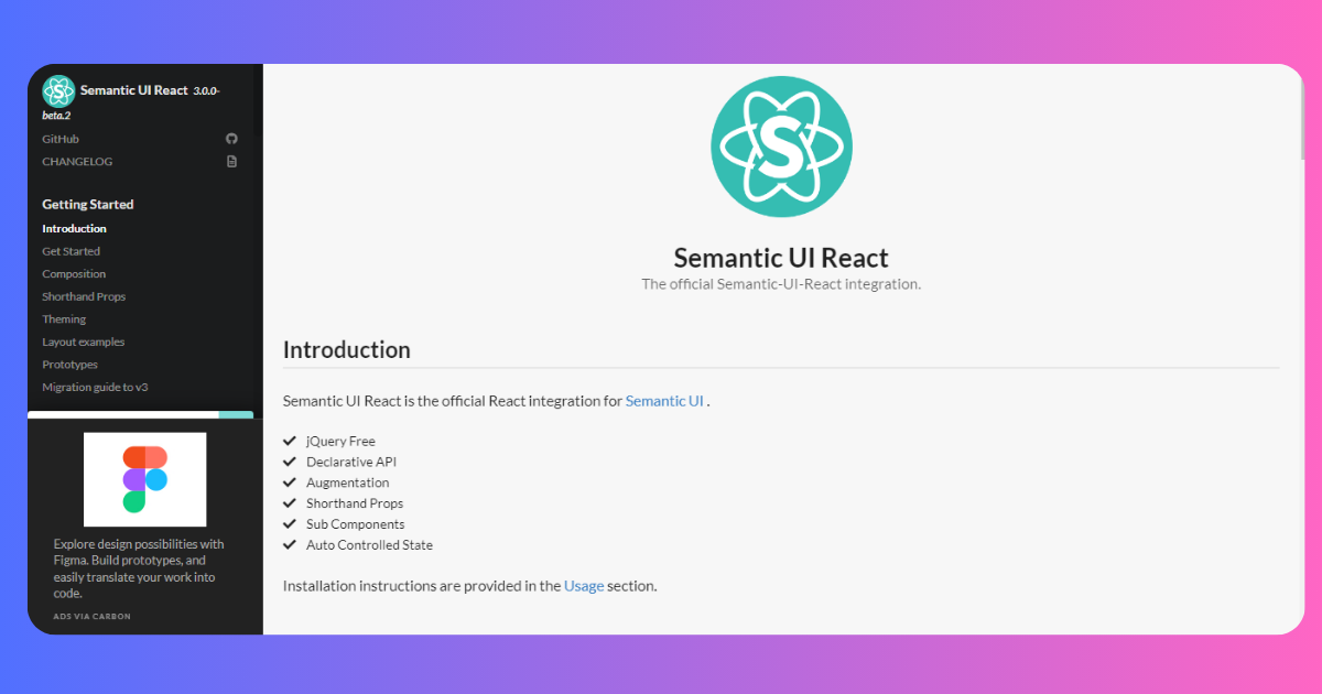
Semantic UI React
Semantic UI is a popular React UI framework known for its clear and human-friendly HTML. Semantic UI React is the official React integration of the Semantic UI and has over 100 components that you can easily use in building your application.
It has over 13.2k stars on GitHub and over 260k weekly downloads on NPM.
KEY FEATURES
- Auto Controlled State: The components in Semantic UI React that have states self-manage their states out-of-the-box, without wiring. This means you don’t need to write the state logic explicitly, as it is handled automatically.
- Shorthand props: Semantic UI React uses shorthand props to generate markups. For instance, icon props can accept string names, can be object props, or an
<Icon />instance.
Copy
1 |
|
- Augmentation: It makes use of augmentation. This means that a component can be rendered as another component using the as props.
Copy
1 | <Header as "h1"> |
BENEFITS
The features above are some of the major benefits of the Semantic UI React. Other benefits include;
- Theme: Semantic UI React offers theme support and allows you to customize the layout, and styles to your feel.
- Community Support: Semantic UI React has an active community, so you will always find tutorials, third-party tensions, bug fixes, and answers to your questions and challenges.
- Developer Experience: Semantic UI React is quite easy to use. The documentation is also easy to work around and locate the things you need.
Onsen UI
Onsen UI is an open-source React UI library that is also mobile-focused. It’s excellent for building hybrid and mobile web applications. They also have IOS and Android material design support.
Onsen UI has a native look and feel, as its components are specifically designed for mobile applications. It has over 8k GitHub stars and over 24k weekly downloads.
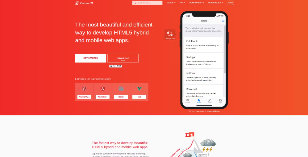
KEY FEATURES
- Customization: You can style components to your app’s design and branding.
- Gesture Support: Onsen UI provides built-in gesture support to make your application feel like a mobile application. Touch gestures like swiping, tapping, and dragging are supported by default. It detects these gestures using a minified version of Hammer.js.
- UI Components: It offers many mobile-friendly components such as carousels, dialogs, navigation drawers, etc.
BENEFITS
- Native Experience: Onsen UI offers a set of UI components that mimic the native mobile application designs and feels, providing you with the same user experience as a mobile application.
- Performance: Onsen UI is optimized for performance to ensure a smooth and animated transition for a better user experience.
- Cross-Platform Compatibility: Onsen UI allows you to build mobile applications that work for both IOS and Android platforms using a single codebase.
- Theme: The Onsen UI library supports and has built-in themes that you can choose from for your application. You can also customize the theme to your project’s brand.
Core UI
Core UI is a customizable library for building responsive web applications. Core UI is an enterprise UI library that leads open-source admin dashboard templates. It has dozens of admin templates you can buy and download for your use.
Core UI also provides cross-browser compatibility. It has over 600 GitHub stars and over 73k weekly downloads.
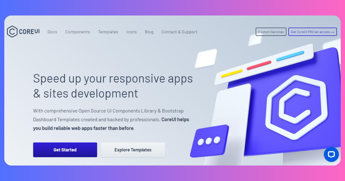
KEY FEATURES
- SASS Support: Core UI is built using SASS(Syntactically Awesome Style Sheets), which allows developers to write cleaner and more maintainable CSS code.
- Icons: Core UI includes icons that can be used in your application. You have to import the icons from the icon package called
@coreui/icons. - Data Visualization: Since Core UI is an enterprise UI library, or in other words, an admin dashboard library, it supports data visualization through Charts.
- Theme: Themes are supported in the library and can be easily customized, too.
- Navigation: Core UI includes routing and navigation components for building multi-page web applications.
BENEFITS
- Customization: The Core UI library is highly customizable, as developers can modify the appearance and behavior of the elements and components, including the templates.
- Responsive Design: Core UI is designed with responsiveness in mind. This ensures that your application works and functions well at different screen sizes.
- Community: The community of Core UI is active. Active communities mean that support is being provided, updates are being introduced, and bugs are being fixed to ensure that the library is maintained and improved.
- Documentation: Another benefit is the documentation. It is written comprehensively so developers can navigate easily, and concepts and usage are explained effectively.
Blueprint UI
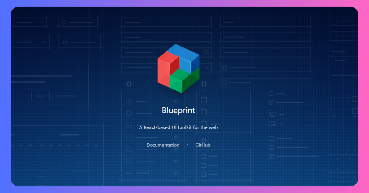
Blueprint is an open-source React UI toolkit to build data-rich user interfaces. It is optimized for complex data-driven UI for web applications. It is a simple-to-use Tailwind React UI library. It has 40+ unique and common components to make your applications great. This library was developed by an infamous company Palantir.
However, Blueprint UI works amazingly for building enterprise desktop applications. The Tailwind React UI library is mostly known for its modularity and scalability. So, you can effortlessly work on complicated designs and large datasets without losing performance.
Key Features
- Blueprint UI is an open-source React UI library to build data-intensive user interfaces.
- You can work on large datasets and complex designs without any hassle at any time.
- It works excellent for enterprise desktop applications that almost need no ongoing support.
- Blueprint UI supports internationalization and makes building applications easy for different regions and languages.
Benefits
- Blueprint UI is a developer-friendly and performance-optimized UI tool kit.
- You can customize the component smoothly.
Drawbacks
- It has no preset themes.
PrimeReact
PrimeReact is an open-source and free React component library. It is a feature-rich extensive library that most popular brands around the world use. With 90+ React components and 280+ UI blocks, it has grabbed the attention of developers smoothly. The library components are designed for the PrimeNG ecosystem.
Moreover, PrimeReact has a design-agnostic infrastructure and is ready to copy-paste UI blocks. It allows you to build an amazing user interface quickly and gives a better user experience. This feature-rich component library allows you to do a lot without installing extra packages.
Key Features
- PrimeReact is a free and open-source React component library with simple and complex components.
- It is a feature-rich library for building responsive React web applications.
- It has a design-agnostic infrastructure allows you to feel like other popular libraries.
Benefits
- All the themes and templates are customizable.
- It allows you to create responsive designs easily.
- Moreover, PrimeReact highly prioritizes accessibility.
Drawbacks
- It has a very limited variety and collection of icons.
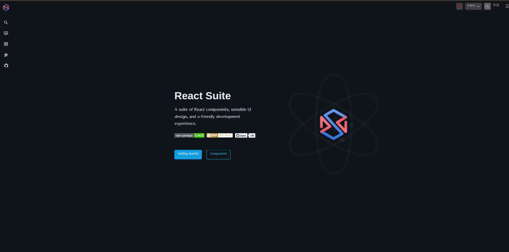
React Suite
React Suite is a set of high-quality React components that provide an excellent developer experience. It is a customizable React UI library that offers rich and extensible UI components.
It has 8k+ GitHub stars and more than 77k weekly downloads on NPM.
KEY FEATURES
- Hooks Support: React Suite has support for React hooks. Developers can use the hooks to manage states and effects.
- Date Visualization: The React Suite library provides chart components for data visualization.
- Form Components: React Suite offers form components such as text inputs with added validation logic.
- Theming: React Suite allows developers to create custom themes and apply predefined themes to align with their preferred choice.
- Routing Integration: React Suite integrates with routing libraries like React Router to simplify the navigation experience.
BENEFITS
- Customization: React Suite has flexibility that allows for styles and theme customizations.
- Accessibility: Just like other React UI libraries, React Suite prioritizes accessibility and provides features like the ARIA attributes
- Performance: It is optimized for performance so the user experience is smooth and components load fast.
- Community Support: React Suite has an active community of developers maintaining, updating, and introducing new features. Tutorials are also easily accessible.
- Consistent Design: The library consistently follows its design principles and guidelines.
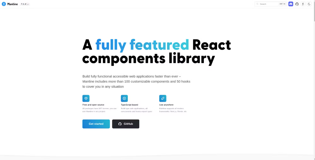
Mantine
Mantine is a fully functional React UI library that has over 100 customizable components and 50 hooks that you can use to build your React web applications. It is also open-source, and TypeScript supported. It has over 25k GitHub stars and over 470k weekly downloads.
KEY FEATURES
- Components: Mantime offers various UI components, from basic components like buttons and input fields to complete components like modals, notifications, etc.
- Theme: Mantim supports themes and allows developers to customize their preferred themes.
- Animations and Transitions: Mantime has built-in support for smooth animations and transitions for a better user experience.
- Hooks: Mantime UI has up to 50 hooks that help simplify tasks like form handling and animations.
- Icons: This library supports icon libraries like react-icons, font awesome, and radix icons.
BENEFITS
- Developer Experience: Mantime provides a good developer experience as the documentation is written well and arranged orderly for easy navigation. It is also easy to learn and use so that beginners can use it without hassle.
- Customization: Developers can customize the typography and themes and adjust stylings to their needs.
- Community Support: With a growing and active developer community, Mantime is well-maintained and updated.
- Accessibility: This is also a priority for Mantime. All components are built to be fully accessible so that developers can build applications for all types of users.
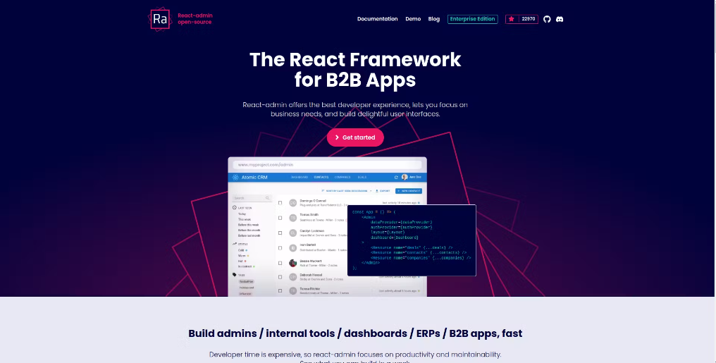
React-Admin
React-Admin is a React UI library that is perfect for B2B applications. Built on top of REST and GraphQL APIs, React-Admin is an open-source library that aims to provide the best experience for developers looking to build admin dashboards. It is currently being used by more than 10k companies across the globe. It has both free and enterprise-tier editions.
React-Admin has over 24k GitHub stars and 61k+ weekly downloads. I highly recommend this library if you want to build any admin dashboard as it offers virtually everything you need to build a highly responsive, and web-accessible admin application.
KEY FEATURES
- Data Visualization: React-Admin provides different chart types to allow the admin to visualize data and information.
- Authentication: React-Admin lets you secure your admin application with built-in authentication. It delegates the authentication logic to its
authProviderobject. - Form Validation: react-Admin uses the react-hook-form library to validate input forms. You don’t have to write validation logic as it handles it for you.
- Internationalization (i18n): React-Admin uses English as its default language. However, you can display your admin contents in other languages, using its translation features like the i18nProvider and a set of hooks:
useTranslateanduseLocaleState
BENEFITS
- Accessibility: React-Admin prioritizes accessibility. It uses the WAI-ARIA standard to make the components accessible. This includes keyboard navigation, arai-attributes, etc.
- Theming: React-Admin supports custom themes. You can easily customize the theme of your admin application to your preferred choice.
- Responsiveness: The library is built to be mobile-responsive by default so that your admin application looks neat and works well in different screen sizes.
- Developer Experience: The documentation is properly written and well-arranged to simplify navigating. It is easy to use and understand as every concept is well explained. Developers don’t have to worry about the UI of their application and can focus on the business logic side.
- Community Support: The community support is also wonderful. There is active maintenance of the library, and articless and tutorials are available.
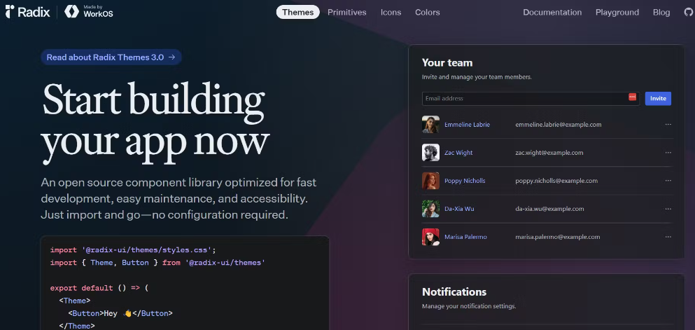
Radix UI
Radix UI has rapidly gained traction among developers for its unique approach to building user interfaces. It offers unstyled React components, meaning that you have to apply your own brand’s styles to its components. This allows you to create websites with unique designs that stand out from the crowd.
Radix UI is used by brands like CodeSandbox, Vercel, and Supabase. It has over 15k GitHub stars and 8 million weekly downloads.
KEY FEATURES
- Radix Themes: Yes, Radix UI is unstyled. However, it provides colors and other styles that you can access via Radix Themes — its theming system. Radix Themes allows you to customize the appearance of Radix components by defining custom values for border-radius, light, and dark mode, accent colors, etc.
- Radix Colors: This is Radix UI’s color system with over 390 colors. There are colors for different use cases, including ones for backgrounds, interactive components, borders and separators, and for accessible texts.
- Radix Primitives: This is a collection of over 25 unstyled components that Radix UI provides. Instead of providing styles for the components, Radix UI focuses on their styles and allows you to use your preferred styling solution.
- Supports Server-Side Rendering (SSR): For applications that require SEO benefits or faster initial load times, Radix UI is compatible with server-side rendering. This capability ensures that your application can be rendered on the server, improving performance and search engine visibility.
BENEFITS
- Improved Accessibility: By prioritizing accessibility from the ground up, Radix UI helps developers build inclusive applications that cater to users with disabilities.
- Faster Development: While Radix focuses on unstyled components, its growing library of higher-level components can significantly speed up development time.
- Enhanced User Experience: The combination of customization and performance leads to a better user experience. Applications built with Radix often feel smoother and more responsive.
- Lightweight: Radix UI is a lightweight library that offers optimal performance and fast load times, even for complex applications.
- Supports Incremental Adoption: You don’t have to commit to a complete overhaul of your existing project to start using Radix UI. Its modular structure allows for gradual integration of components into your application.
Frequently Asked Questions about React Component Library
What is a React component library?
A React component library is a vast collection of React components. It consists of ready-to-use components for React applications. These libraries help you to make your work easier and save you time. They contain reusable, simple, modern, and responsive components. So, you can just copy-paste the elements and make a good React application in no time.
How do I choose a React component library?
There are various React UI libraries. So, it takes work to choose the best from them. But if you look for some specific features, the work gets easier. While selecting the best React UI library, you need to take a look at the
- Variants of components
- Customization, flexibility, and accessibility
- Responsiveness and device compatibility
- Documentation and support.